Frontend/2024
Craft / Interface system
An accessible component foundation for consistent product interfaces, not just a gallery of buttons.
Illustrative case study, not a claim of client work or measured production outcomes.
Concept case study. Demo and repository links are intentionally omitted; replace this content with your own verifiable project and public links.
Context
Overview
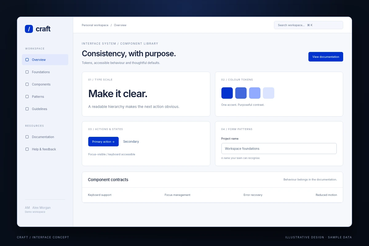
Craft is a design-system concept that connects tokens, accessible interaction patterns and documented React components. Its goal is to help a product team make consistent decisions without hiding every interface behind an inflexible abstraction.
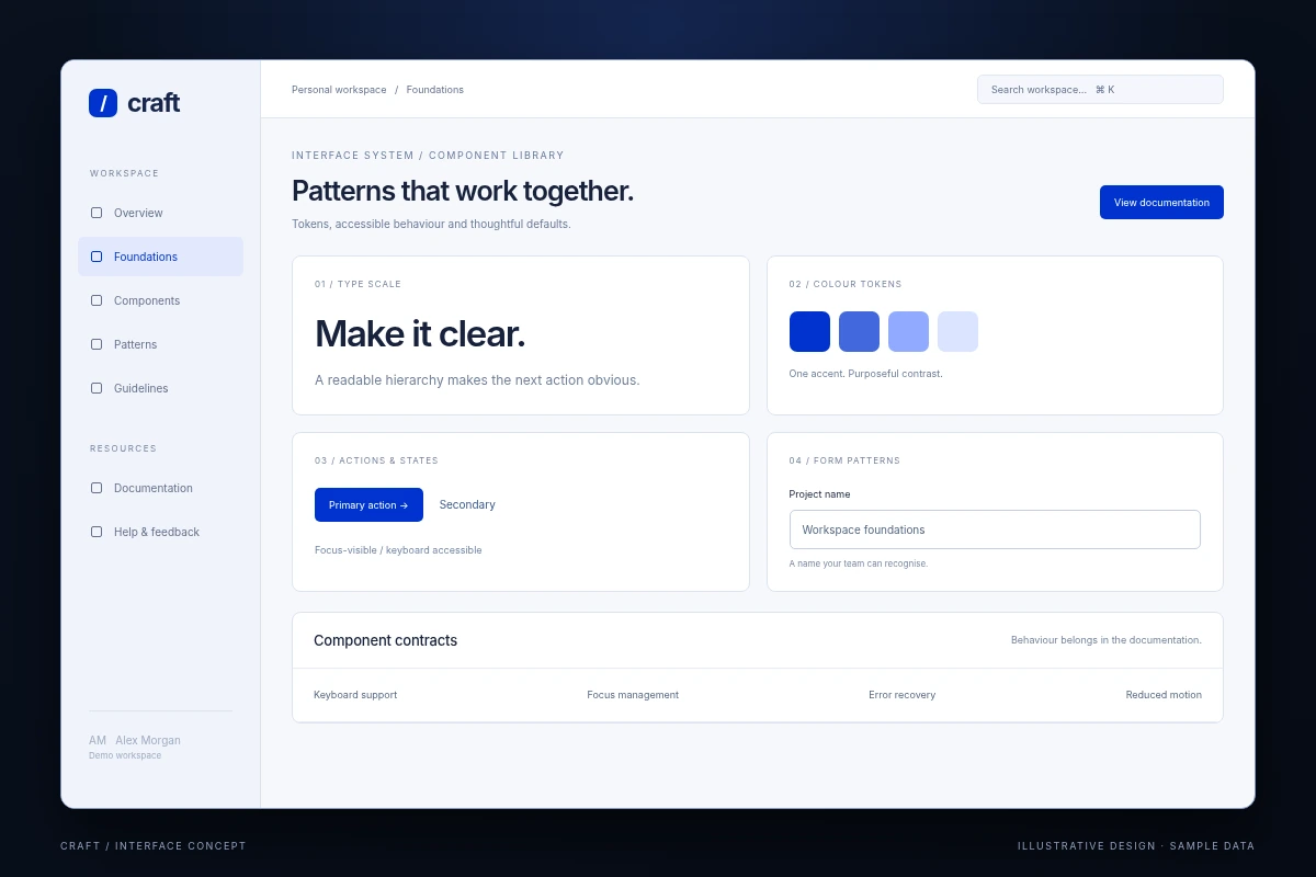
The sample screens explore the component catalogue and a product form built from the same primitives.
The problem
Visual inconsistency is often a symptom of missing shared behaviour. Two similar dropdowns can differ in focus handling, validation feedback and keyboard support even when they look identical.
The system needs to capture these interaction requirements alongside appearance and make breaking changes visible to product teams.
The solution
The proposal starts with a small token layer and a limited set of components that have clear contracts. Documentation includes usage guidance, empty and error states, keyboard behaviour and examples of when not to use a component.
Semantic HTML is preferred over generic elements with custom interaction code. Complex widgets are added only when the product needs them and their accessibility behaviour can be tested.
Ownership, made explicit
My contribution
- Component engineering: define typed public APIs and predictable controlled/uncontrolled behaviour.
- Interaction quality: implement keyboard navigation, focus return and form feedback patterns.
- Documentation: write practical examples and explicit limitations for each component.
- Change management: propose versioning, migration notes and regression tests for public component contracts.
- Design partnership: credit visual and interaction specifications to the hypothetical designer; do not claim that role as engineering work.
Architecture
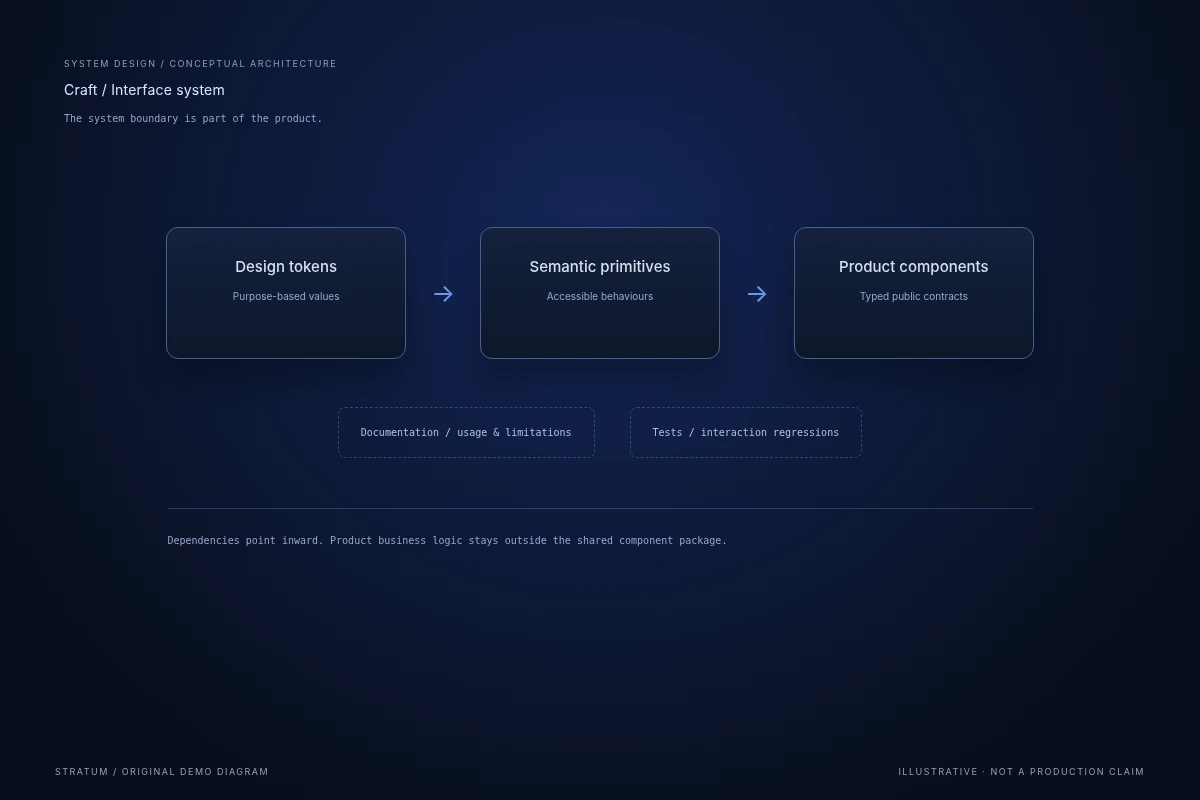
Tokens feed CSS custom properties. Low-level semantic primitives support composed React components, which are consumed by the application and the documentation environment.
The dependency direction is deliberate: product-specific business logic should not leak into the shared component package. Examples demonstrate integration without becoming hidden dependencies.
Key features
Token-based theming
Colour, spacing and type values are named by purpose, with contrast checks on actual combinations.
Accessible interaction contracts
Keyboard behaviour, focus ownership and label requirements are documented with the component.
Practical product examples
The catalogue includes validation, loading and empty states rather than only ideal screenshots.
Challenges & trade-offs
A highly configurable component can become harder to use than several clear components. The proposed API exposes meaningful product variation but avoids arbitrary boolean combinations.
Automated checks help detect regressions; they do not replace keyboard and assistive-technology testing or review of the content placed inside a component.
Results & impact
The concept defines a component taxonomy, token structure and acceptance checklist. It makes maintainability and interaction quality part of the design-system story.
Adoption, task completion and defect reduction would need evidence from a real product team. No such outcome is claimed by the sample content.
Screenshots
Technology stack
Version control, code review and small, reversible changes.
DocumentationComponent-driven interfaces and predictable client state.
DocumentationTyped application contracts and maintainable UI code.
Documentation